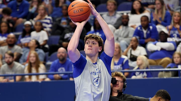
Kentucky basketball uniforms, we all love them or hate them. Every Wildcats fan has an opinion on them, and today, we are going to look at some of the best and worst uniforms since the 1990s. From the eye-brow raising to the iconic, we're starting off with the worst uniforms:
The 3 worst uniforms
3. 2016 white checkerboard home uniforms
I don't think I know anyone who liked the checkerboard being added, but if you block that bit out, it's not too terrible.

2. 2016 blue checkerboard away
Again, it's not super terrible, but the checkerboard stood out even more on the blue, so it ranked worse than the home jersey.

1. 2015 white lettering
White on white looked meh, but the real issue was that it looked too much like Duke's jersey (see the two following images), and we can't have Duke and Kentucky looking the same now, can we?


Honorable mentions for worst uniforms
2012 Blue Hyper Road UK logo
2012 platinum one time use jersey
The 3 best uniforms
3. 2012 Home white
Simple, traditional, and recognizable. All the things you want in a nice jersey

2. 1992 White Home
I love the shorts' design, and again, it is instantly recognizable as a Kentucky jersey. Should we bring back the power K?

1. 2000s Blue Away
It's easily Kentucky's best jersey in the modern era, and I wish we could get back to the design.

Honorable mentions for best uniforms
2013 one time throwback White used against Florida
2005 Kentucky throwback home uniforms
There you have it! Kentucky has a history of classic design hits and some adventurous misses. Can’t wait to see what Mark Pope and Nike can cook up for this new generation.
*One awesome jersey I didn't list because it will always hold a special place in Kentucky fans' hearts is the black Bill Keightley jersey worn to honor Mr. Wildcat after he passed away, an awesome gesture with his name across the back of every jersey.
What say you? Did your favorite make the cut? Want to see more alternates like the Oregon Ducks? Or should we just rock the blue and white?
