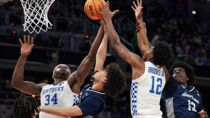
When you say Kentucky basketball anything is fair game and open for debate and that includes the ever-hot topic of uniforms. Love or hate the checkerboard our friends at Nike have given us a new look for the Bahamas next week to like or loath.
While this isn’t any earth-shattering topic I can assure you every blue-clad Wildcat fan will gladly give you his or her two cents worth. Plus it’s August and we need some more things to debate over and we get actual basketball games next week to watch, dissect and dish out more opinions.
For now, let’s just have some fun with what our boys will be wearing at the Baha Mar Resort next week for four games. While none will likely ever be seen in Rupp Arena let’s check them out and see what you think.
The Wildcats open on Wednesday, August 10 against the Dominican National U22 Team. The following night they tangle with Monterey Tech (Mexico). The best competition will be most likely on Saturday, Aug. 13 against Carleton Univ. (Canada). The Big Blue closes out the trip with a game on Sunday, Aug. 14 squaring off with the Bahamas National Team.
Let me start by saying I have never been a huge fan of the checkerboard. I don’t despise it but Kentucky basketball is a tradition and doesn’t need flashy things on the uniforms.
Tradition is that UK logo and the words KENTUCKY are spelled out across the chest.
I will say that the newly teased and unveiled uniforms by Sahvir Wheeler, Daimion Collins, and Cason Wallace had no sign of the checkboard and looked so much better.
https://twitter.com/KentuckyMBB/status/1555176774836707329
If you took a poll of Big Blue Nation a high majority would favor dumping the checkerboard. They have long let Athletic Director Mitch Barnhart know of their dislike. Along with not having alcohol at games, however, that is a whole separate debate.
Look No. 1 is the traditional white uniform Wallace had on. Basically very traditional with Kentucky spelled out in a half circle on the front around the number. The pant has a simple UK logo on it. Purists will like this and other than palm trees sewn in for the islands looks, which looks really cool on the shoulders and could be used at any time and place.
Look No. 2 was worn by Collins and is all blue but the Kentucky scripting on the front of the jersey is vintage cursive and goes up from the lower left to the upper right. There are white shoulders on top, white down the shorts and a large white trim at the bottom that is several inches and the UK logo appears on the right side.
Look No. 3 – This will probably get more negative feedback. Black unis.
Wildcats ✨ At Night ✨ pic.twitter.com/wk2yY2hRwC
— Kentucky Men’s Basketball (@KentuckyMBB) August 4, 2022
Wheeler showed off the look that is basically the same as the blue one that Collins had on except the UK logo is replaced by the Wildcat logo on the right leg. It also has white shoulders and white trim at the bottom.
Except for one other glaring thing on the front instead of Kentucky spelled out we have the name “Wildcats” written in script.
My take is I like some of the changes but not all of them, and remember we may never see these again unless fans let Barnhart know their feelings. I don’t think you will see them in the newly annoucned game with Gonzaga or other big marque games.
The white is very traditional and I don’t mind that.
The blue I love other than the scripting on the front looks more like a baseball uniform at first site. It may grow on you and I think it would.
Our colors are blue and white. I have never been a lover of all-black uniforms.
Ok on the football field it looks better but for basketball, I vote to toss it in the box and tape it shut. I also don’t like Wildcats spelled out as well.
Wildcats is in the top ten most popular collegiate nickname with over 30 teams using it.
There is only one KENTUCKY!
Let me know your likes and dislikes. Love it or trash it.
