


I’ll start off this post by clarifying that I fully support the Kentucky football team and I am excited for the upcoming season…
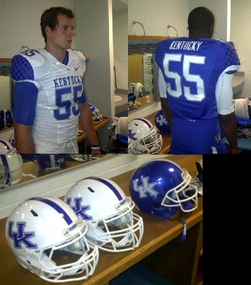
Now on to today’s subject matter. The Wildcats introduced their new Nike uniforms for the 2011 season last Thursday, and while most of the fan base seems to be happy with the result, I am extremely disappointed. It’s not that I hate the digs themselves, but I hate the idea behind them. Here are the pictures if you haven’t seen them yet.
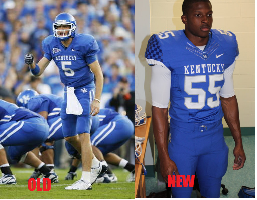
The more I think about Kentucky changing their uniforms, the more sense it makes to do something really unique. The Kentucky football team does not have the tradition or history that Notre Dame, Penn State, Alabama, Texas, USC and others have. I have no problem with Penn State rocking what look like high school uniforms until the end of time because that’s who they are. They’re all about the tradition their school has. Kentucky’s tradition is being a bottom dweller in the SEC and that’s not really something to get excited about now is it? Oregon was the first to really make waves by going crazy with their uniform combinations and while I think theirs are a little out there, it got them noticed. Without any real tradition or history to fall back on, The Ducks decided to go cutting-edge instead of old school and it clearly worked. Oregon is widely considered one of the ‘hip’ schools right now and I really do believe that their jersey combinations play a role in that. So why not Kentucky? What does it hurt? It’s not like there’s even really a coach that people identify with UK football. The basketball Cats have worn silver and black uniforms in recent years. The UK basketball team, with all the tradition and history is willing to switch things up, but the almighty football cats can’t. I just don’t understand the decision to keep things mundane when some excitement could be added. Here’s the 2010 version side by side with the 2011.
I really don’t like the interlocking UK for that matter either. It’s boring and looks a lot like Houston’s logo. Can someone please explain the blank spot in the middle where the U and the K meet too? It looks like someone forgot to finish the trim there.
I was really hoping for the old power K to return or for a new logo all together. I know the ‘penis-cat’ was probably a bigger headache than it was worth, but the University could really use a new logo with an actual wildcat on it. This is just something I found in google, and while I wouldn’t necessarily go with this rendering, here’s an aggressive attempt to update to old logo.
I’ll admit that the away set is actually not bad and the return to white helmets is overdue. The added color to the sleeve is nice, and while I’m not crazy about using the secretariat silk pattern again, I don’t hate it either. Recent news also indicates that there are other variations that UK did not release at the unveiling (one player told me that he was told that there IS a black alternate). That takes me to the overall point of this post. I’m beginning to get a little frustrated by this administration’s decisions to play it safe. It’s just like punting on 4th and two. Instead of taking the opportunity to do something really cool that would energize a large portion of the fans and excite recruits, the Cats went with the safe option by adding some tweaks. I wanted something exciting and fresh. Something new. Something that would make waves even if it’s ugly. The problem isn’t really with the new uniforms, it’s with the decision to play it safe. I wanted an injection of excitement. Much like the product on the field last year, I was hoping to be blown away but ended up underwhelmed. I hope that’s not a feeling I’m going to need to get used to in Joker’s tenure.
Keep following www.http://wildcatbluenation.com for the best in Kentucky basketball and football news, rumors, and opinions. By Kentucky fans for Kentucky fans